Redesigning the Marhelm Platform

Redesigning the Marhelm Platform

Overview

Overview

Marhelm is an investor-centric maritime and commodity data platform designed to provide users with data-driven insights on over 50 publicly traded shipping companies. The platform offers comprehensive information to help users gain a competitive edge in the market.

Despite its potential, the platform faced several user experience (UX) challenges that hindered user engagement and growth. This case study outlines how a detailed redesign process addressed these challenges and ultimately led to a 2x increase in subscribers.

Role

Role

UX/UI Designer

UX/UI Designer

UX/UI Designer

UX/UI Designer

Team Involved

Team Involved

Designer, Developers, Stakeholders

Designer, Developers, Stakeholders

Designer, Developers, Stakeholders

Designer, Developers, Stakeholders

Time Frame

Time Frame

3 Months

3 Months

2 Months

2 Months

Problem Statement

Problem Statement

The Marhelm platform, while rich in data, suffered from a range of UX issues that made it difficult for users to navigate and leverage its full potential. Stakeholders reported concerns about user engagement, platform usability, and overall design coherence. Additionally, the platform lagged behind competitors in terms of design, user experience, and branding.

The Marhelm platform, while rich in data, suffered from a range of UX issues that made it difficult for users to navigate and leverage its full potential. Stakeholders reported concerns about user engagement, platform usability, and overall design coherence. Additionally, the platform lagged behind competitors in terms of design, user experience, and branding.

Initial Analysis

Initial Analysis

  1. Identifying UX Issues

  • Conducted a thorough audit of the existing platform and documented UX issues related to navigation, design inconsistency, and information overload.

  • Presented these issues to the stakeholders for alignment and prioritization.
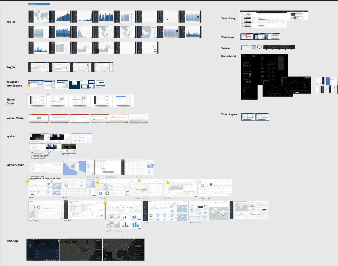
  1. Competitor Analysis

  • Analyzed platforms like KPLER, Koyfin, Lloydslist Intelligence, Signal Ocean, Vessel Value, xyzt.ai, and Vizionapi.

  • Observed key strengths in their user interfaces, such as streamlined navigation, clear data visualization, and effective use of color and typography.

  • Identified gaps in Marhelm’s platform compared to competitors, focusing on:

    • Simplification of complex data

    • Data presentation methods

    • User onboarding experiences

Understanding the Users

Understanding the Users

  1. User Persona Development

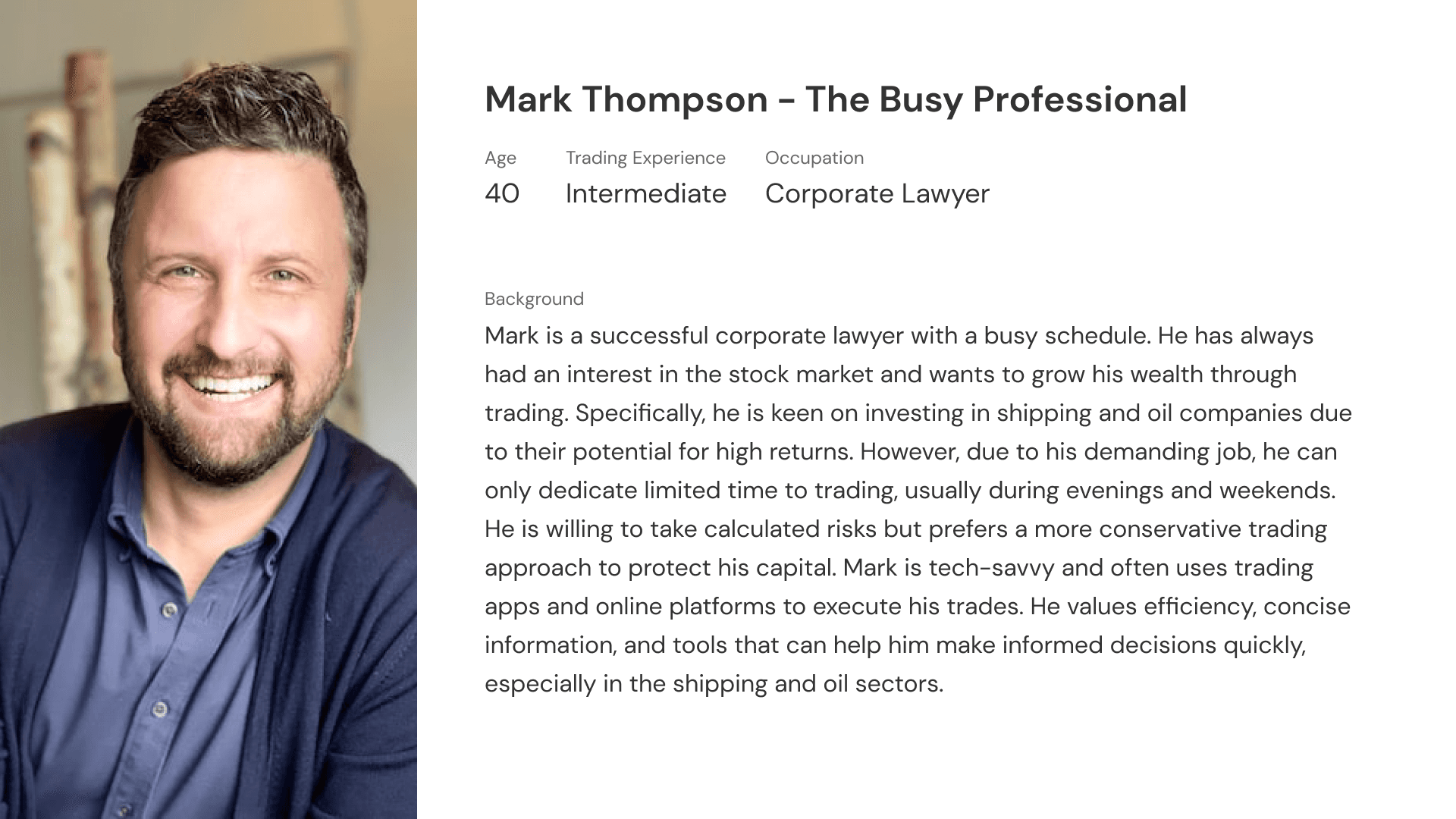
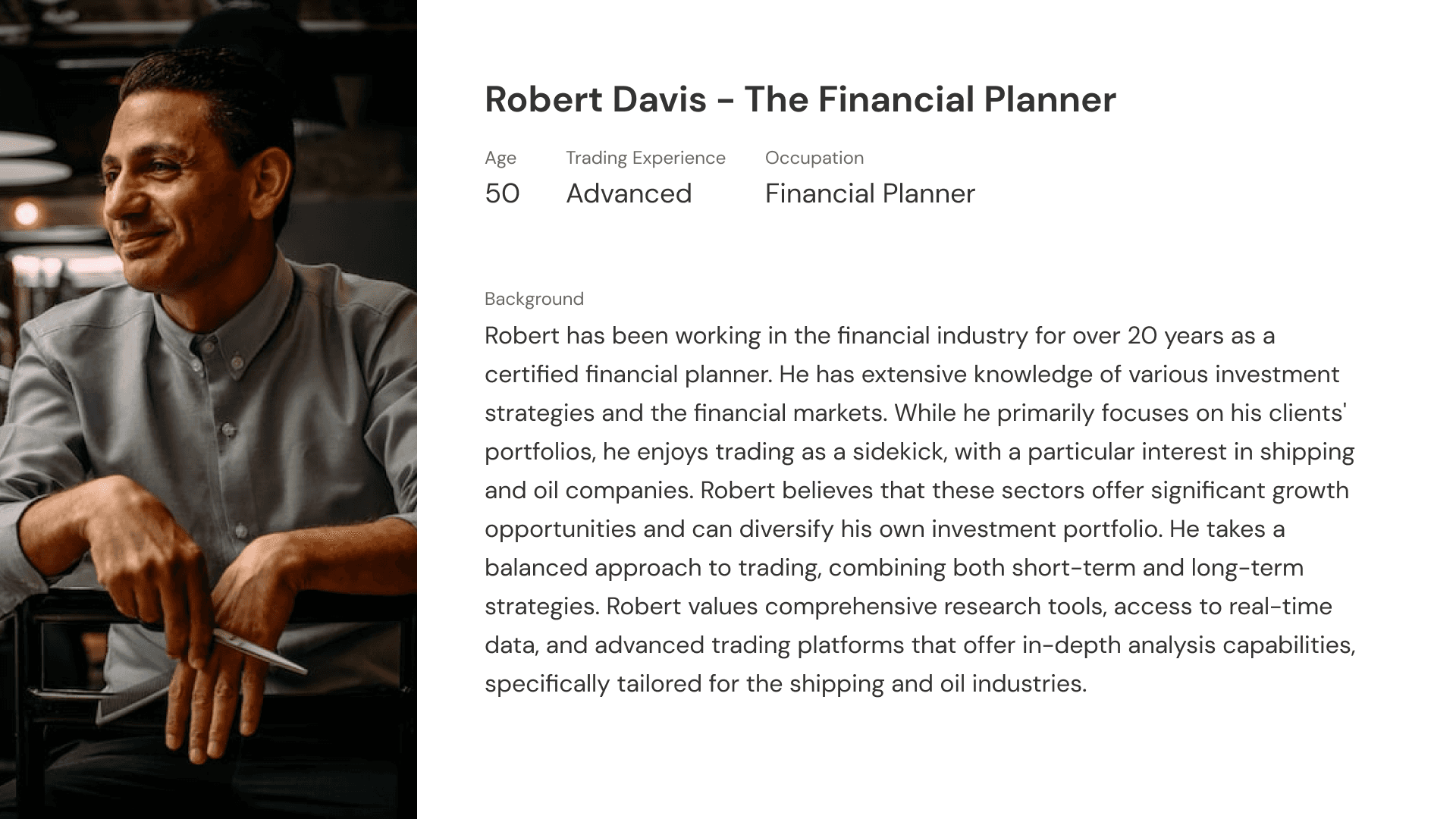
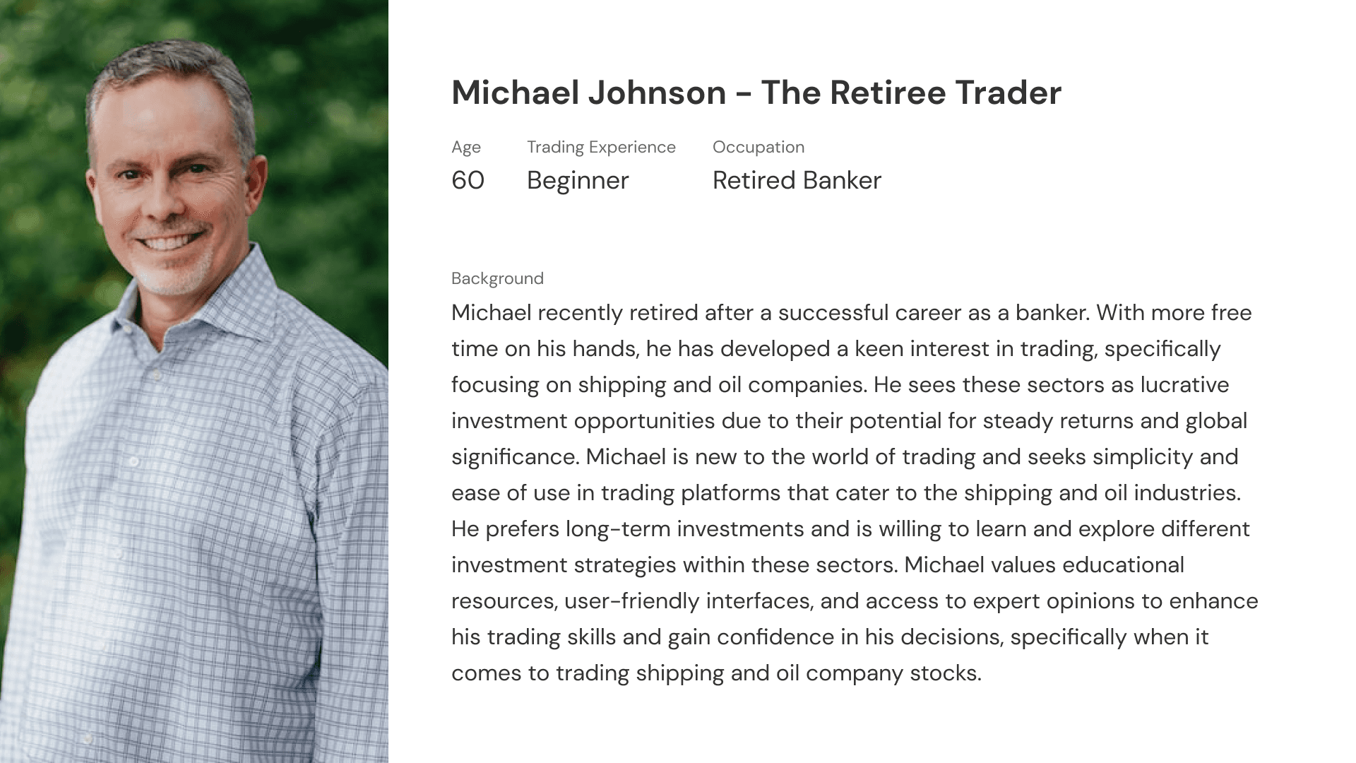
  • Created detailed user personas to better understand our audience, which primarily included investors, traders, and analysts in the maritime and commodity industries.

  • Focused on their pain points, such as:

    • Difficulty in finding specific data quickly

    • Lack of intuitive navigation

    • Challenges in understanding industry-specific terminologies
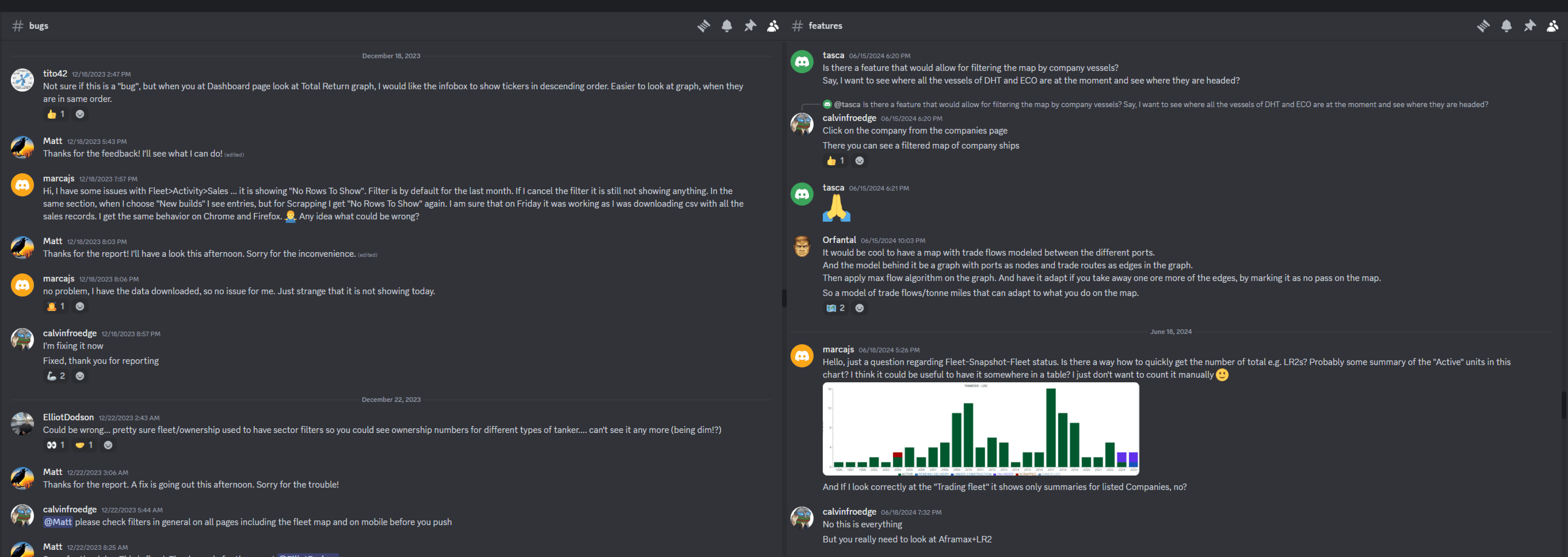
  1. Community Feedback

Engaged with Marhelm’s 500+ community members to gather direct feedback on pain points, feature requests, and desired improvements.

  • Key insights from feedback:

    • Users needed faster access to key data points

    • Data visualization needed to be clearer

    • Navigation was cumbersome, requiring too many steps to reach important data
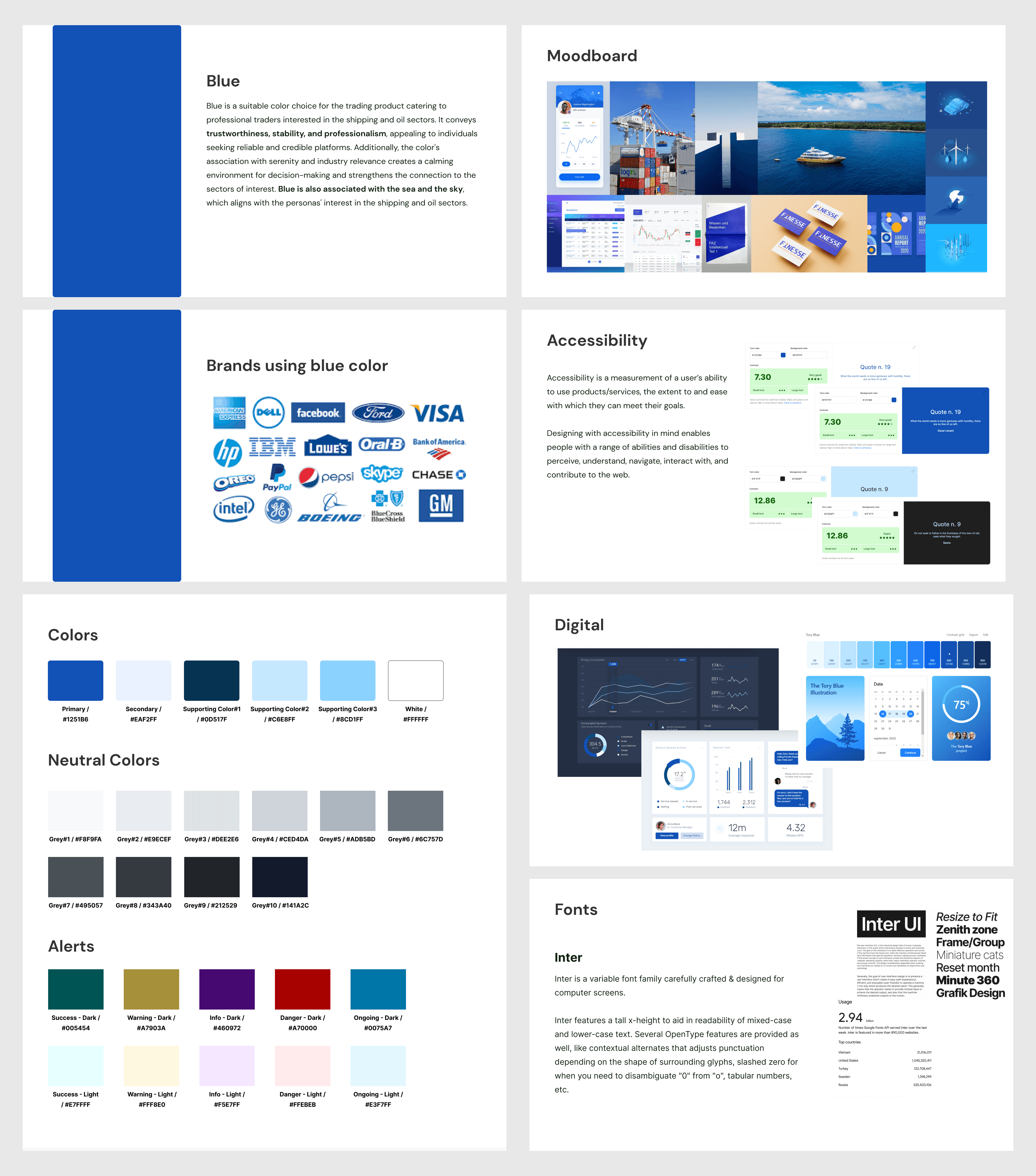
Branding & Design Strategy

Branding & Design Strategy

  1. Branding Overhaul

  • Developed a cohesive branding strategy for Marhelm, which included:

    • Defining brand colors, typography, and visual mood boards

    • Creating a modern, professional, and trustworthy brand image that reflects the platform’s focus on data-driven insights


  • The goal was to visually differentiate Marhelm from competitors while aligning the design with the needs of its investor-centric audience.

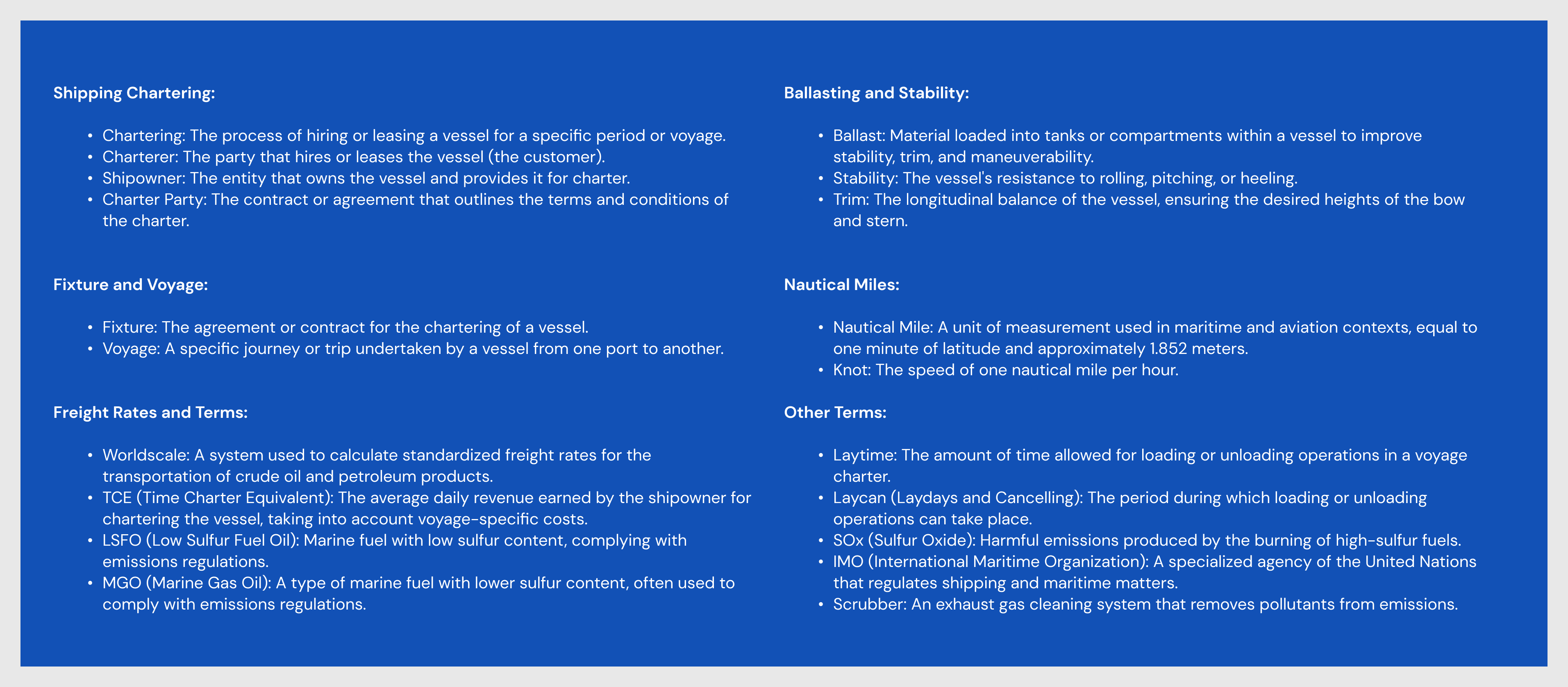
  1. Learning Industry Terminologies

Since I was new to the shipping industry, one of the key challenges was to understand specific terminologies and concepts such as:

  • Shipping Chartering

  • Fixture and Voyage

  • Freight Rates and Terms

  • Nautical Miles

  • Laytime, Laycan, etc.

  • This learning process was critical in designing a platform that communicated effectively with the target audience and ensured the UX was optimized for industry relevance.
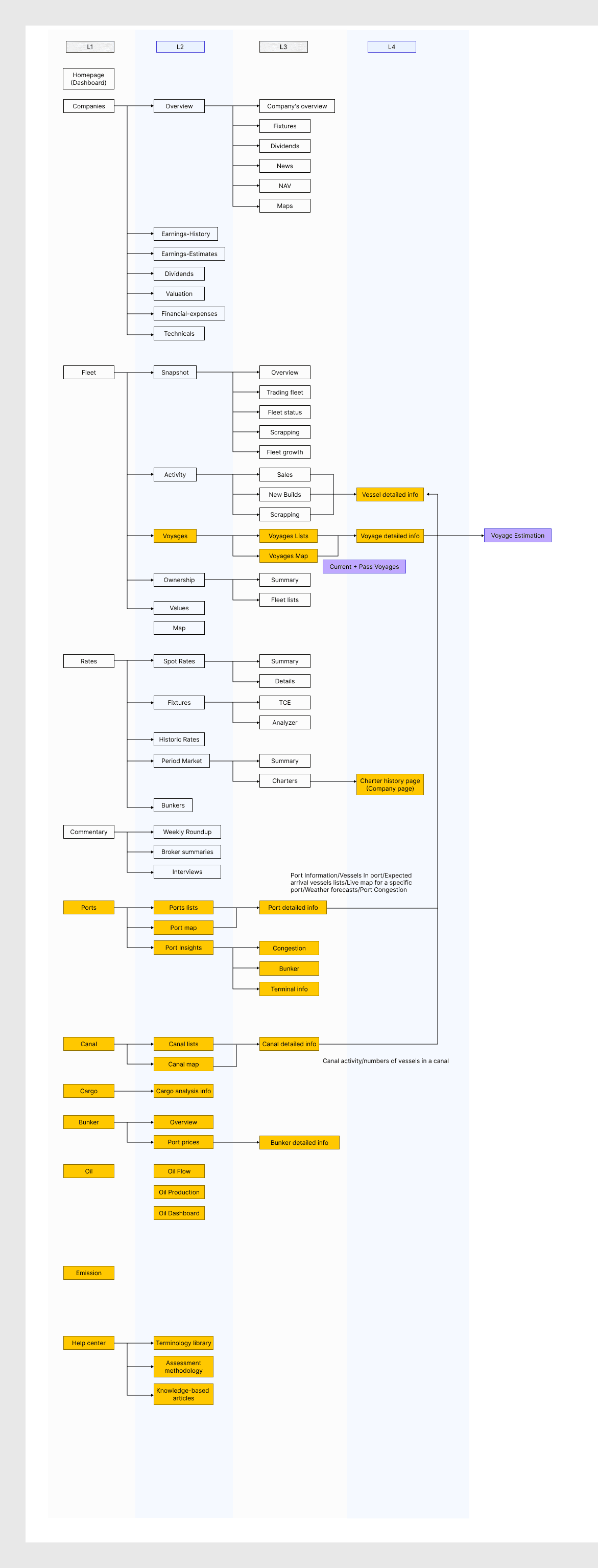
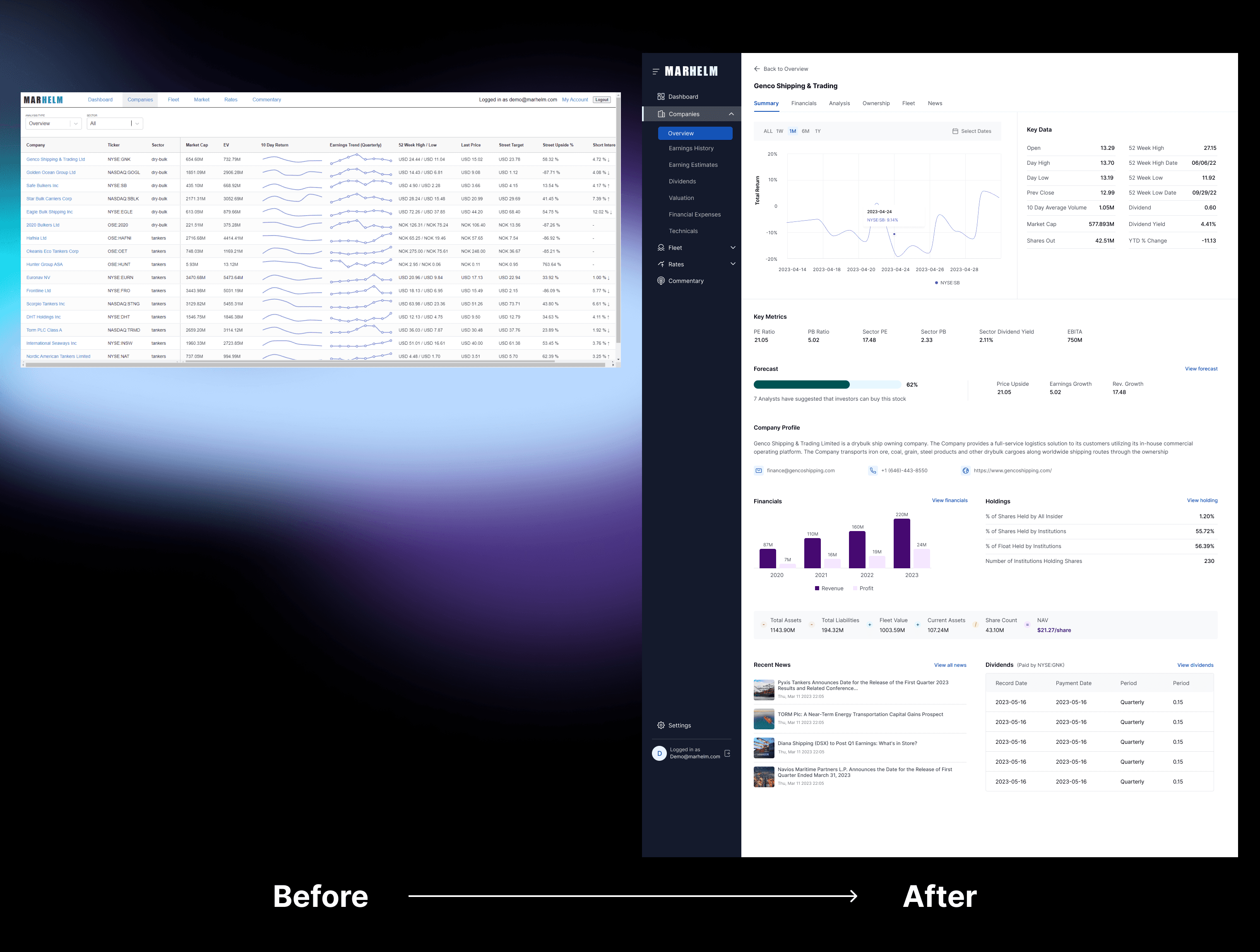
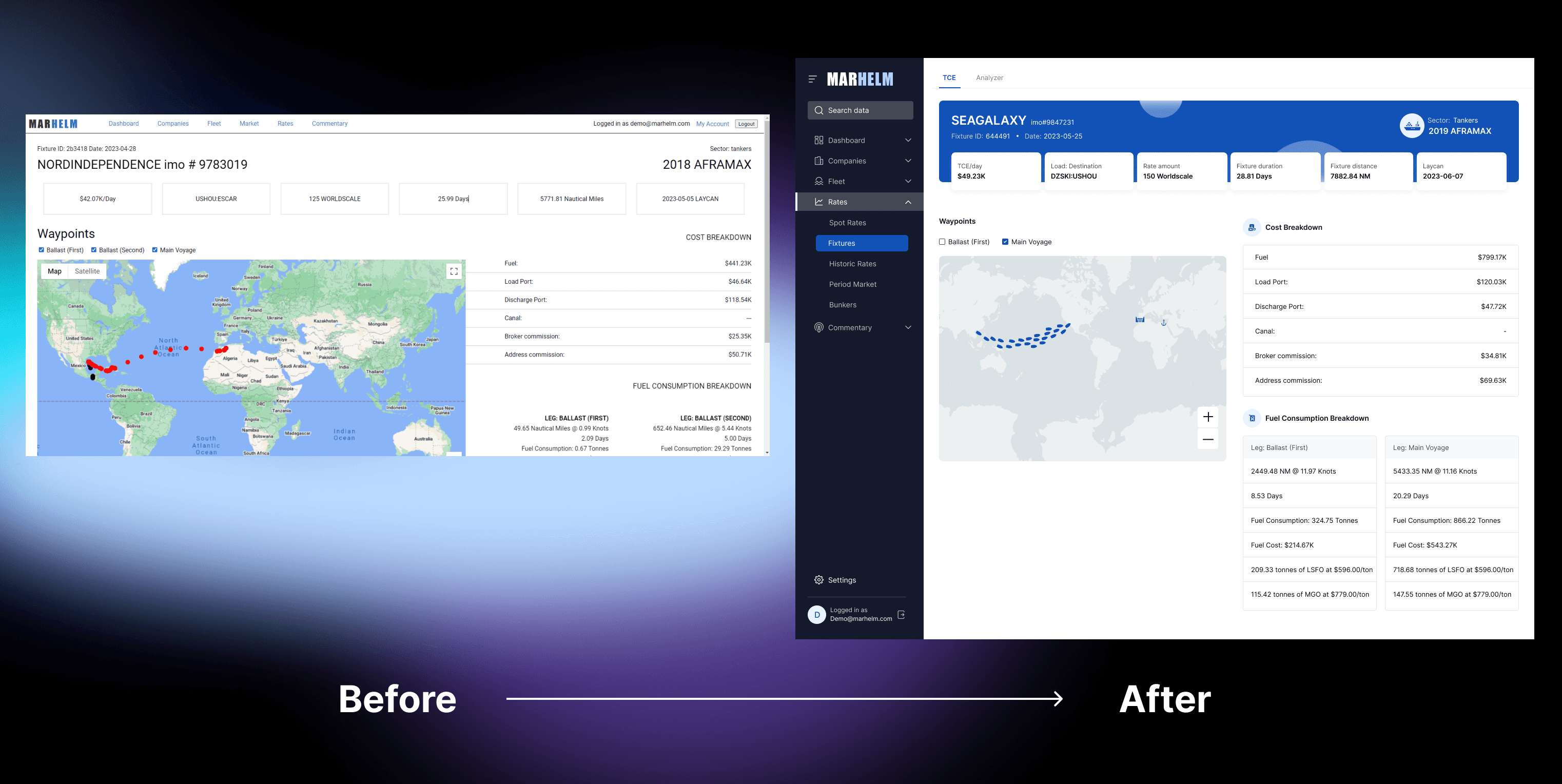
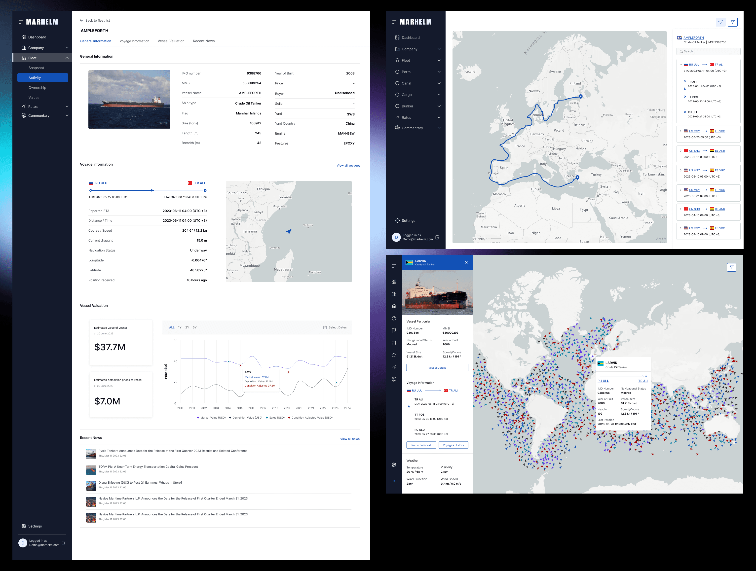
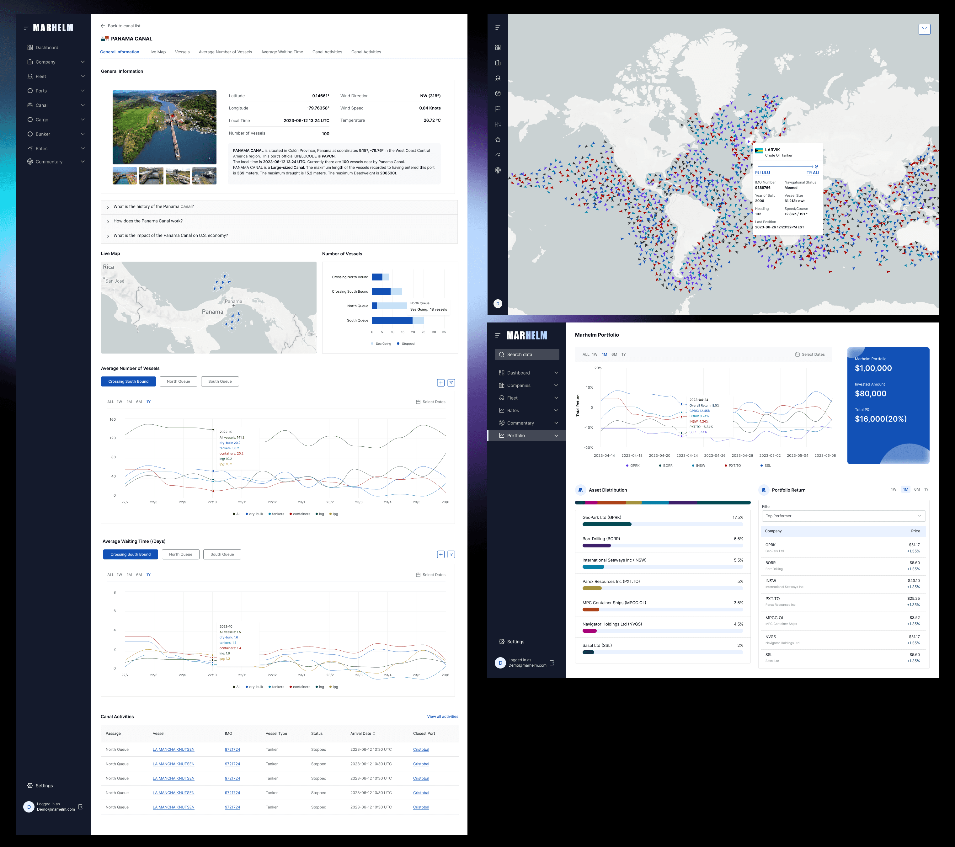
Design Process

Design Process

  1. Site Map Creation

  • Developed a site map to restructure the platform’s navigation, ensuring that important data was easily accessible.

  • Streamlined the flow to reduce user friction, particularly for new users trying to find specific shipping data.

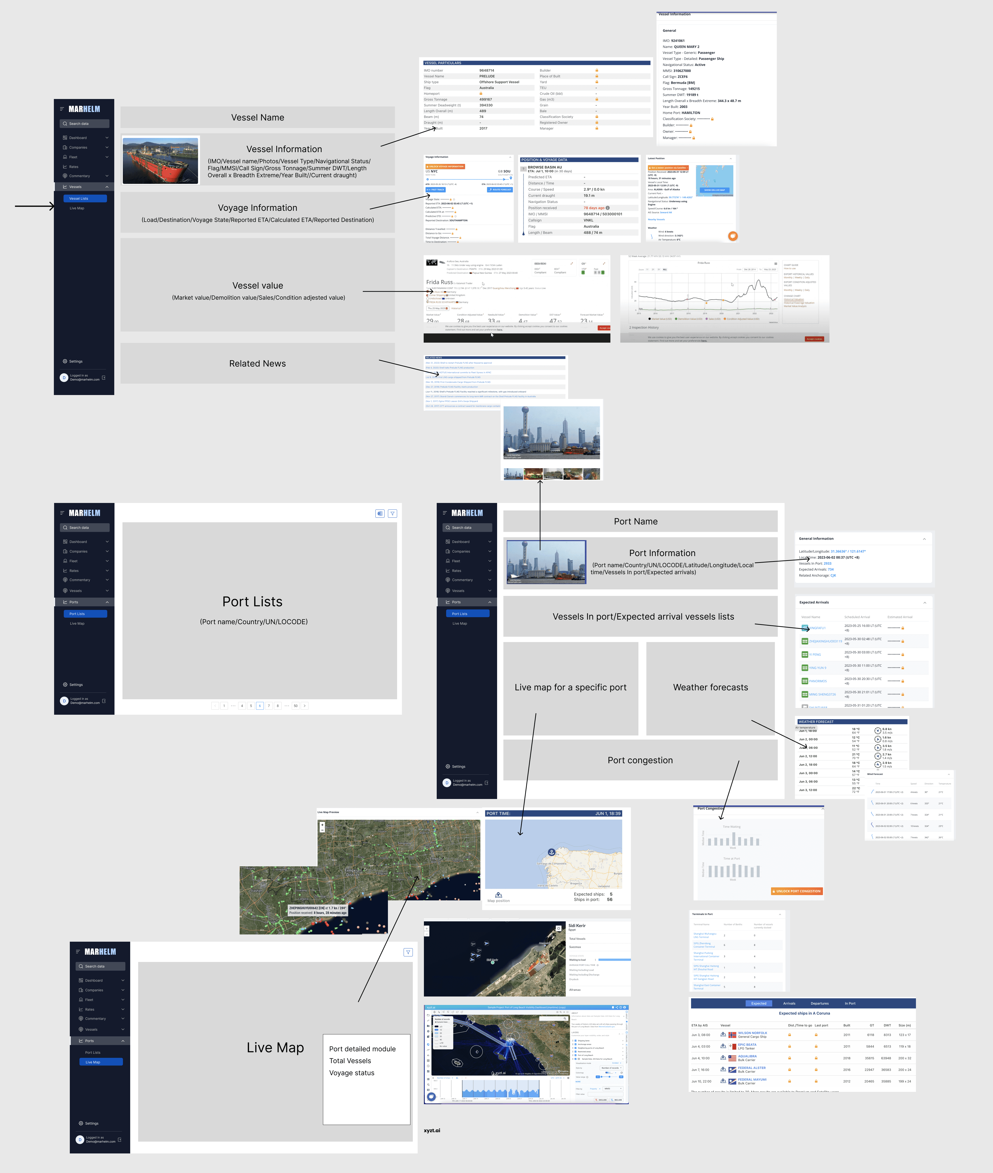
  1. Wireframes and Prototypes

  • Designed low-fidelity wireframes to validate layout and structure with stakeholders before moving to high-fidelity designs.


  • Focused on:

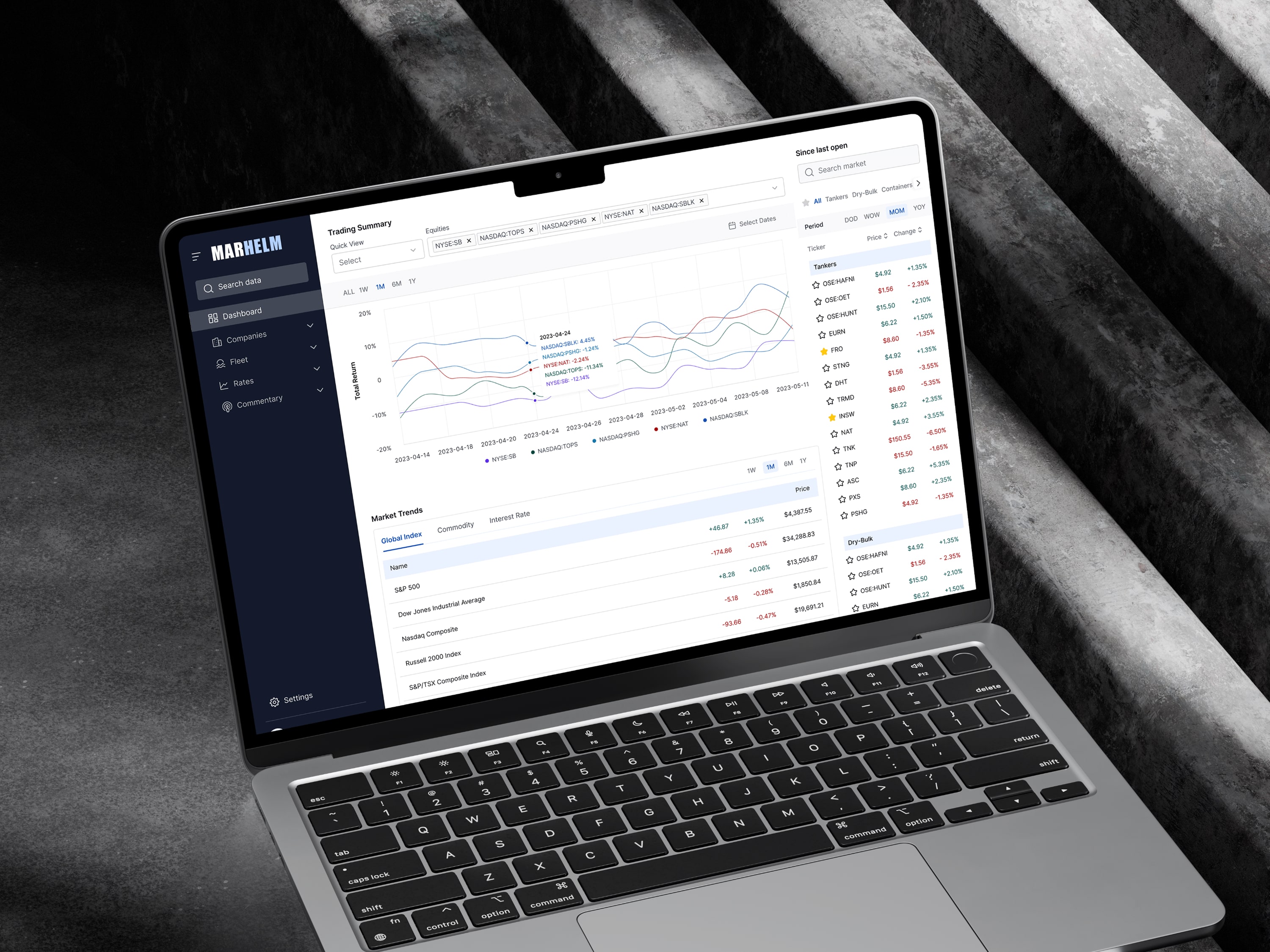
    • Simplifying the dashboard

    • Improving data visualization

    • Ensuring that key data points (e.g., shipping fixtures, freight rates) were prominently displayed

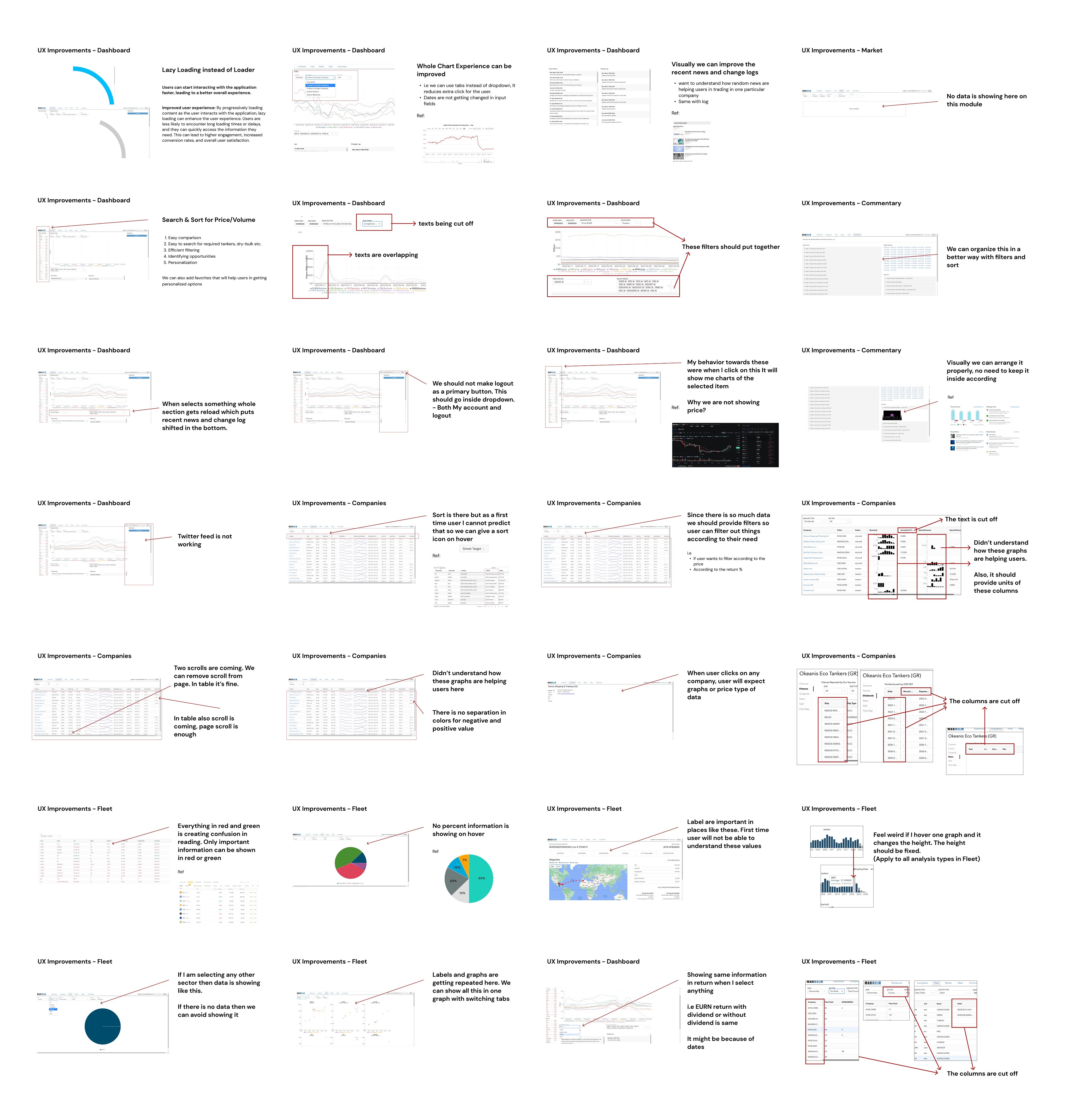
  1. Feedback Integration

  • After presenting prototypes to the community and stakeholders, I incorporated their feedback to fine-tune the design.

  • Iterations were focused on improving:

    • Data clarity

    • Navigation intuitiveness

    • Reducing clutter by minimizing unnecessary graphic elements
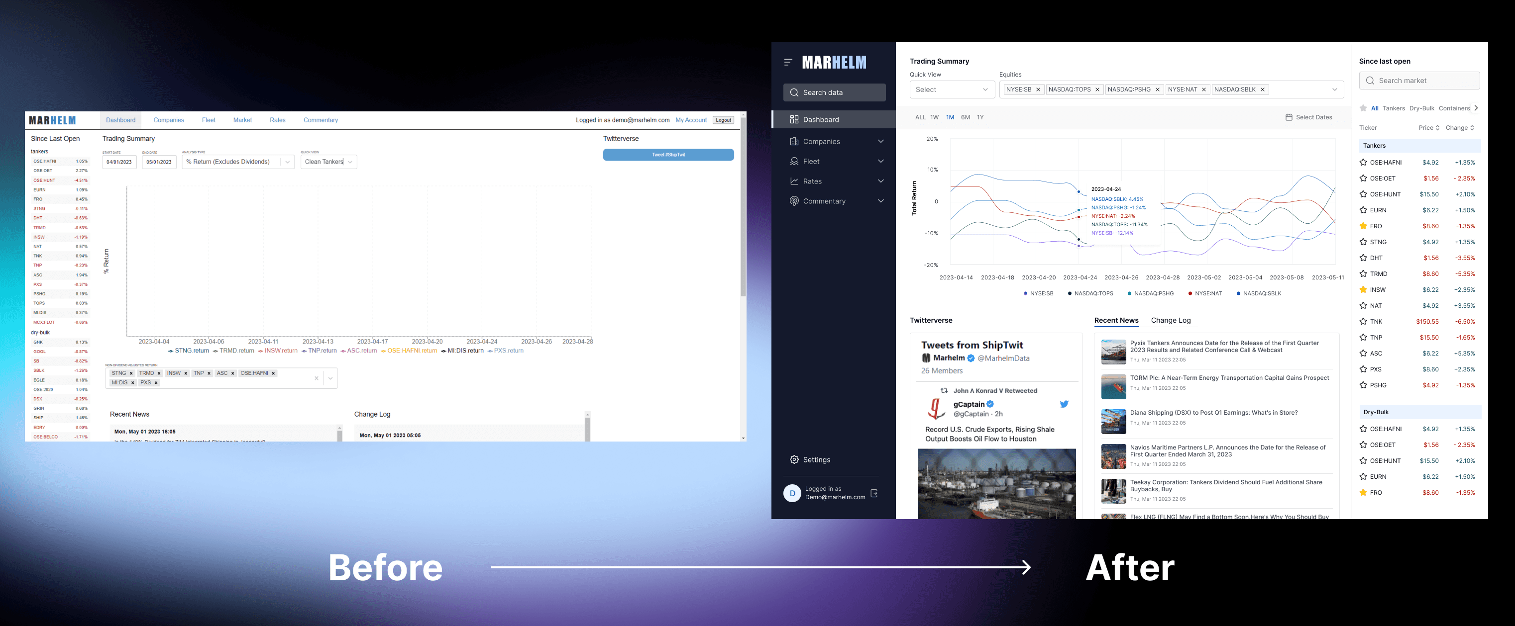
Results & Impact

  • 2x Increase in Subscribers: The redesigned platform saw a significant uptick in subscriptions, largely attributed to the improved UX and branding.

  • Improved Engagement: Users spent more time on the platform, and community feedback post-launch was overwhelmingly positive.

  • Reduced Bounce Rate: The streamlined navigation and faster load times directly reduced the platform's bounce rate.

  • Enhanced User Satisfaction: Users reported a better experience with improved data accessibility, intuitive navigation, and faster load times.

Let's Connect

Reach Out to Start a Conversation or Collaborate on Exciting Projects